Lokal Container Tipografi 📽 Independent 🔩 Open Source Typefoundry 🔗 ©2020 — 2025 📓 Lokal Container Tipografi 📽 Independent 🔩 Open Source Typefoundry 🔗 ©2020 — 2025 📓
LCT BDO Grotesk
Publish Date: 01–05–2023




NEW RELEASE / Ver 2.0
LCT. BDO Grotesk
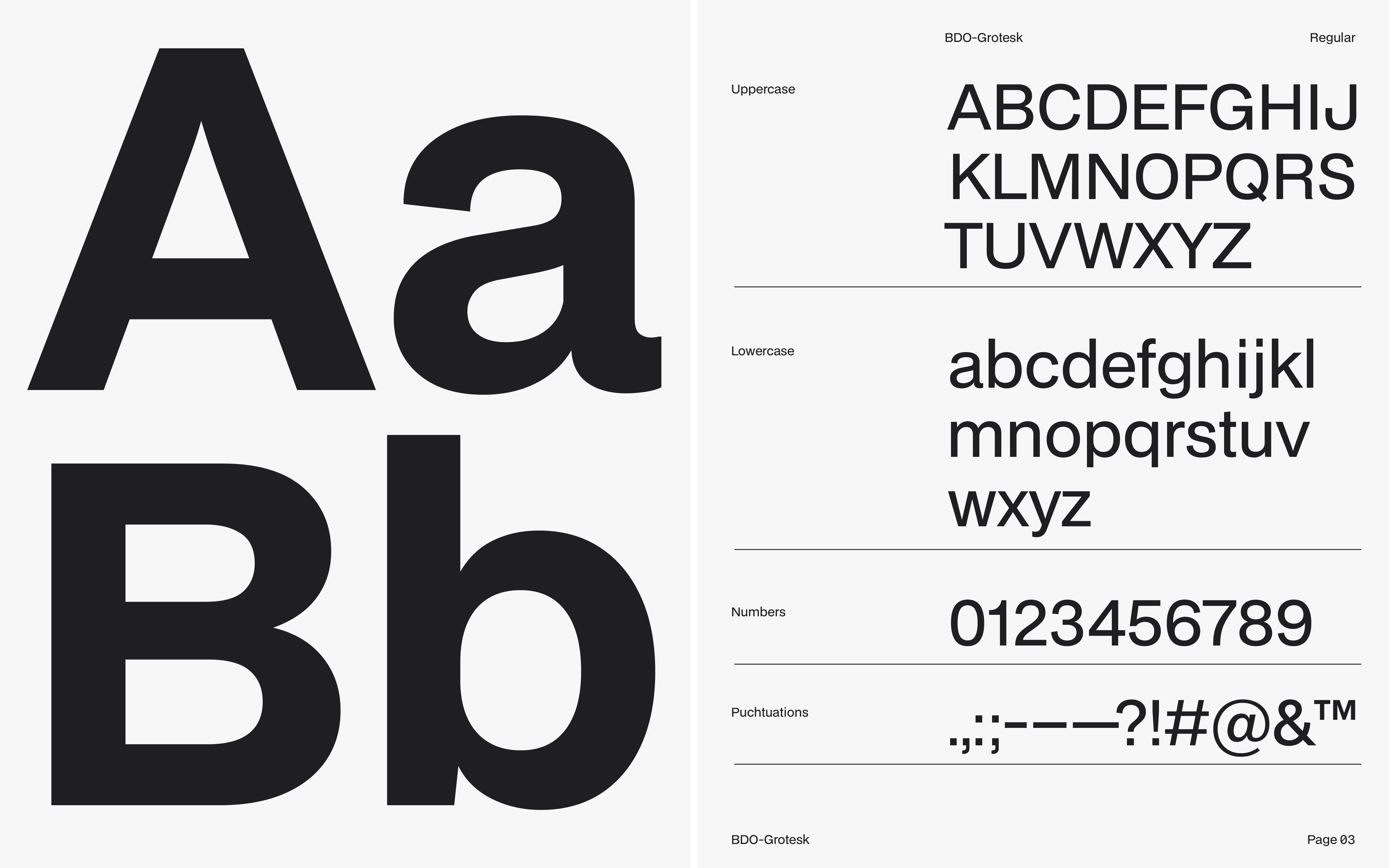
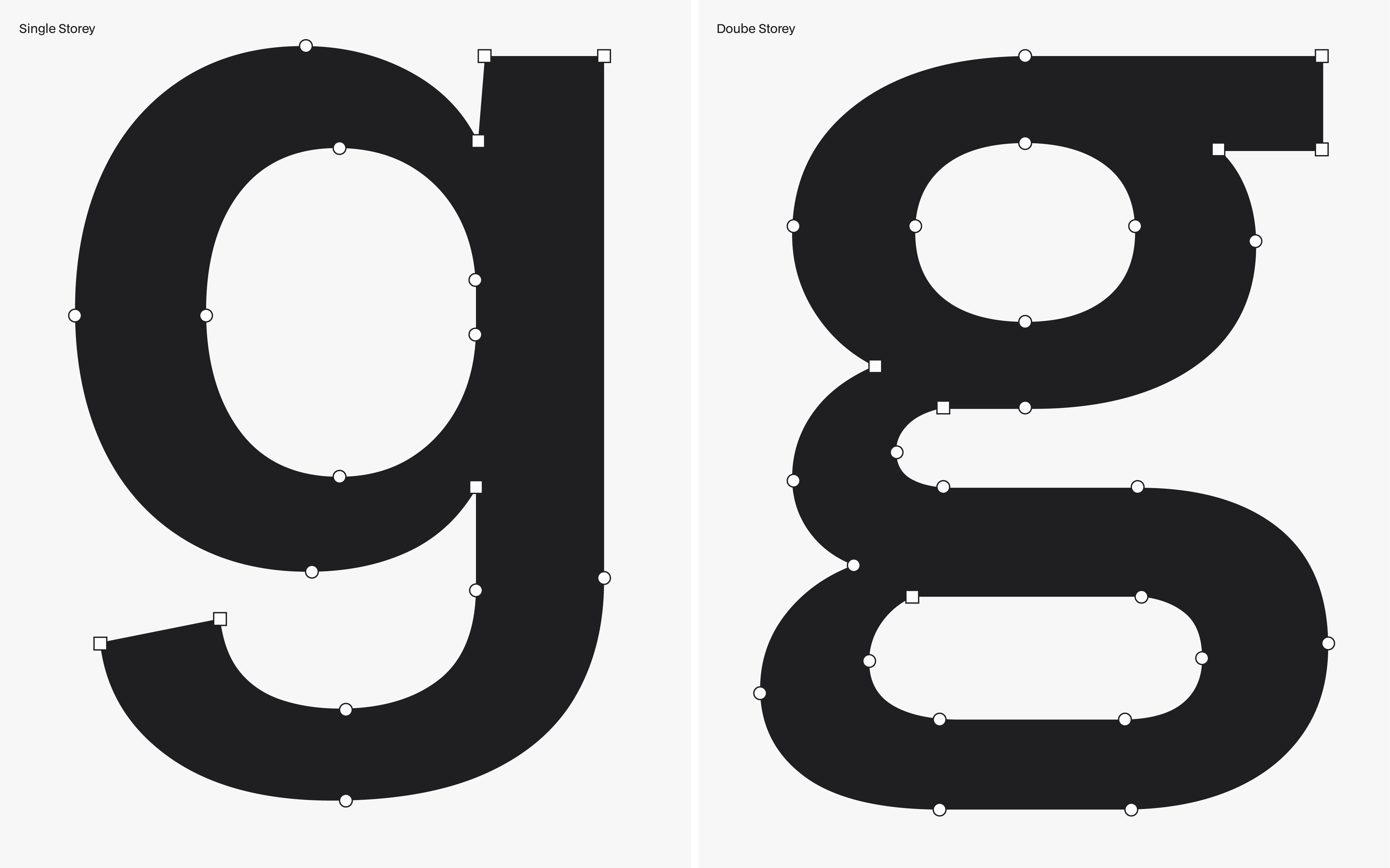
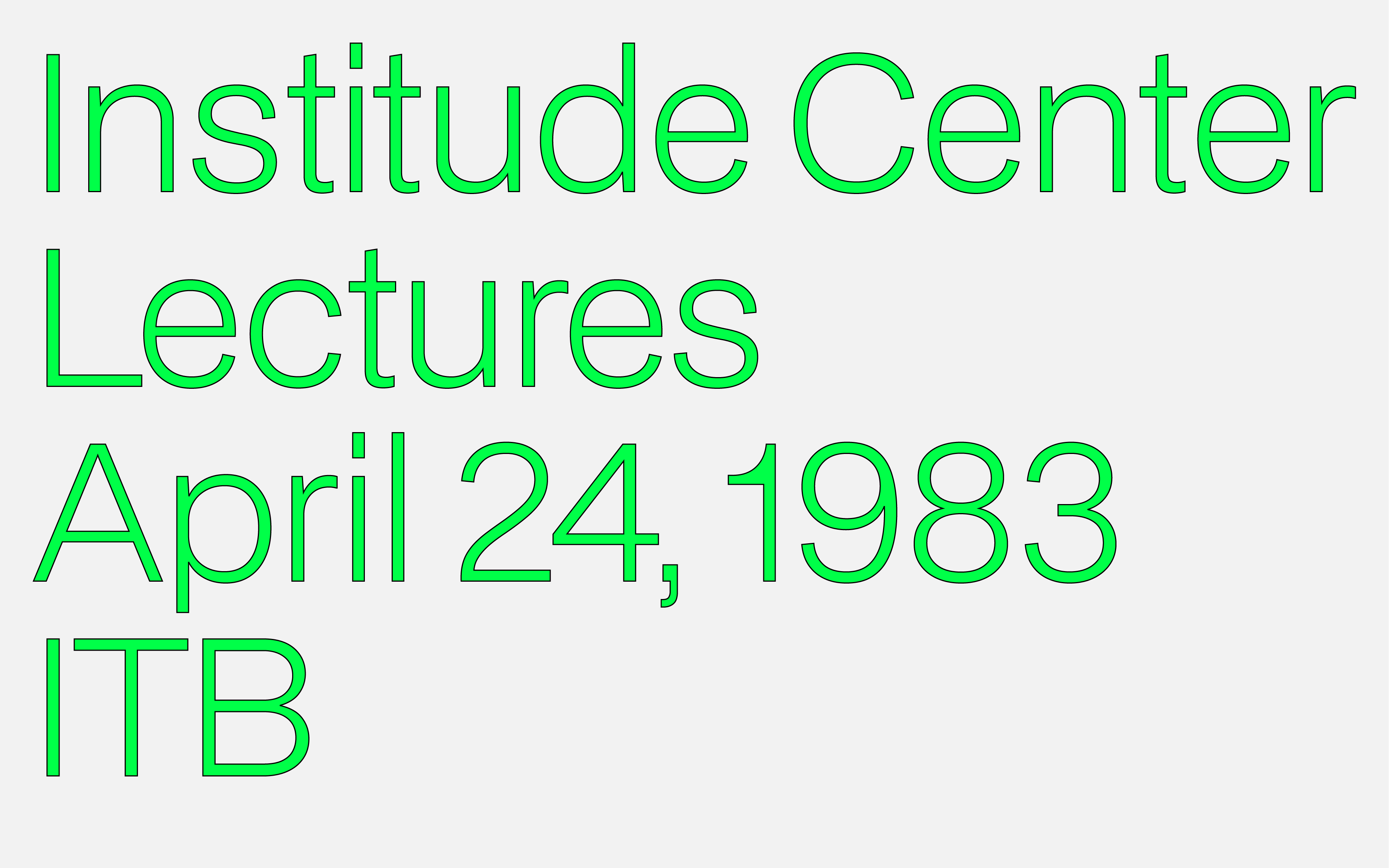
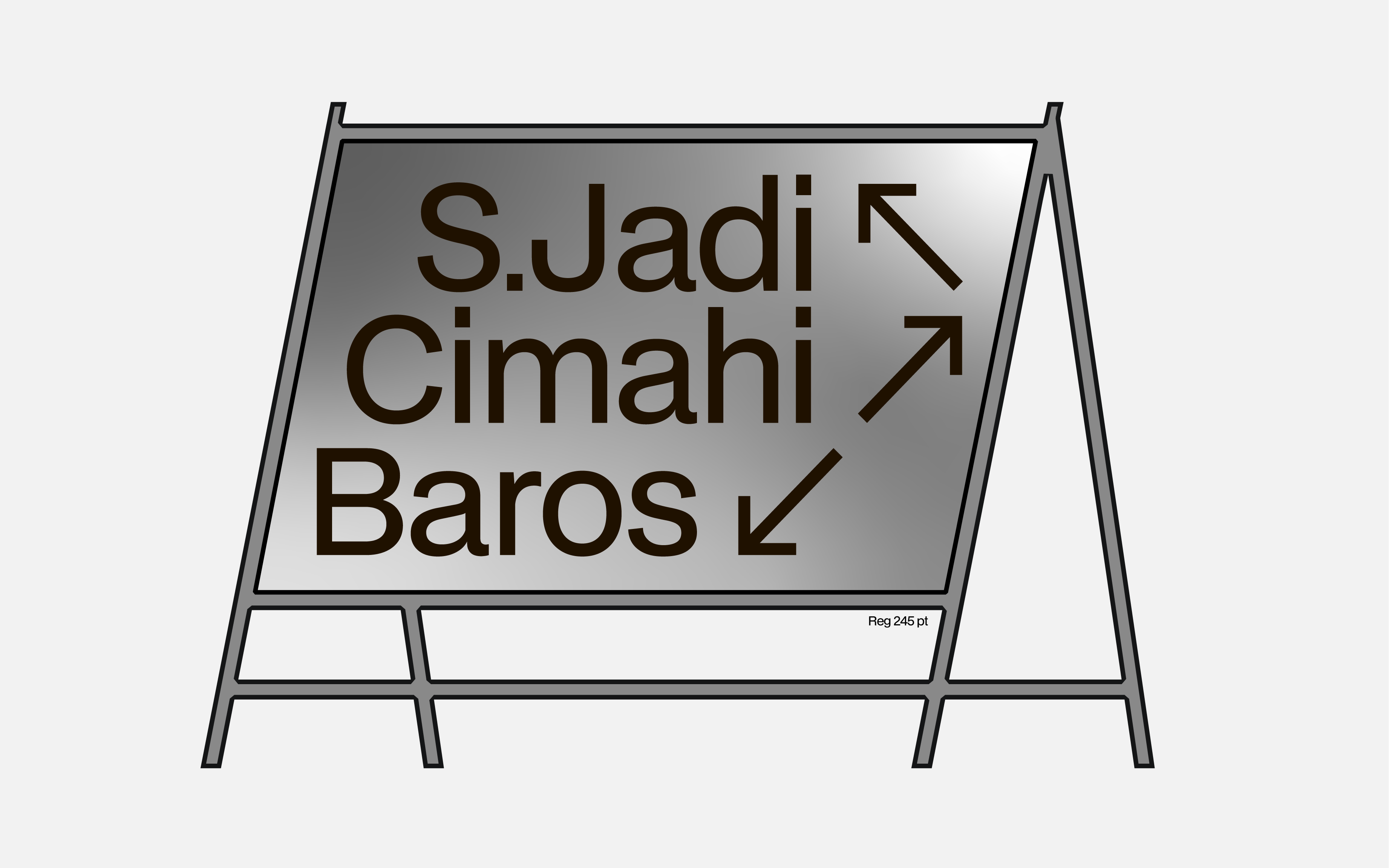
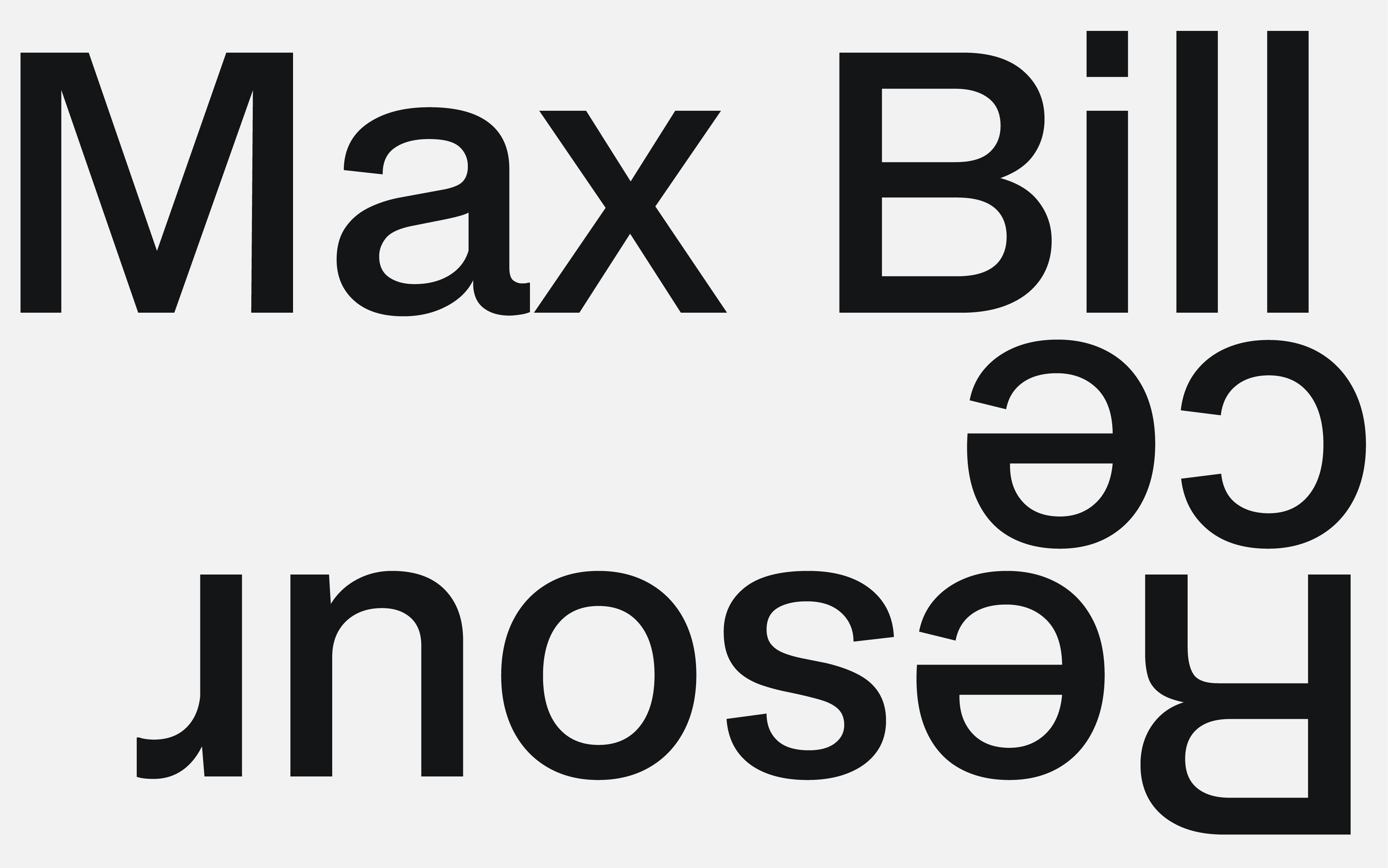
BDO Grotesk is a contemporary neo-grotesque typeface drawing inspiration from the clean, rational aesthetics of modern graphic design systems from the 1950s to 1960s. With its minimalist forms and functional design, BDO Grotesk captures the spirit of mid-century modernism while offering a versatile tool for today’s creative needs.
The typeface is more than just a font; it embodies our perspective in interpreting the city of Bandung. Known as a hub of innovation, creativity, and cultural vibrancy, Bandung has a rich history of shaping industries and movements, from fashion and art to music and design. BDO Grotesk reflects these diverse influences, offering a visual language that unites the city’s legacy with a forward-looking approach to design.
Through its bold geometric structure and subtle nods to the functional beauty of mid-century design, BDO Grotesk becomes a bridge between past and present. It represents the identity of Bandung—a city constantly evolving but deeply rooted in its cultural and industrial heritage.
Available Format: TTF | OTF | WOFF2 | VAR
Version: 2.0.0
Last Update: 09-01-2023
Language Support: Extended Latin / Adobe Latin-1 / ISO 8859
Specimen
LCT Rima
Publish Date: 01–05–2023


NEW RELEASE / Ver 2.0
LCT. BDO Grotesk
BDO Grotesk is a contemporary neo-grotesque typeface drawing inspiration from the clean, rational aesthetics of modern graphic design systems from the 1950s to 1960s. With its minimalist forms and functional design, BDO Grotesk captures the spirit of mid-century modernism while offering a versatile tool for today’s creative needs.
The typeface is more than just a font; it embodies our perspective in interpreting the city of Bandung. Known as a hub of innovation, creativity, and cultural vibrancy, Bandung has a rich history of shaping industries and movements, from fashion and art to music and design. BDO Grotesk reflects these diverse influences, offering a visual language that unites the city’s legacy with a forward-looking approach to design.
Through its bold geometric structure and subtle nods to the functional beauty of mid-century design, BDO Grotesk becomes a bridge between past and present. It represents the identity of Bandung—a city constantly evolving but deeply rooted in its cultural and industrial heritage.
Available Format: TTF | OTF | WOFF2 | VAR
Version: 2.0.0
Last Update: 09-01-2023
Language Support: Extended Latin / Adobe Latin-1 / ISO 8859
Specimen
LCT Utara
Publish Date: 01–05–2023




NEW RELEASE
LCT. Utara
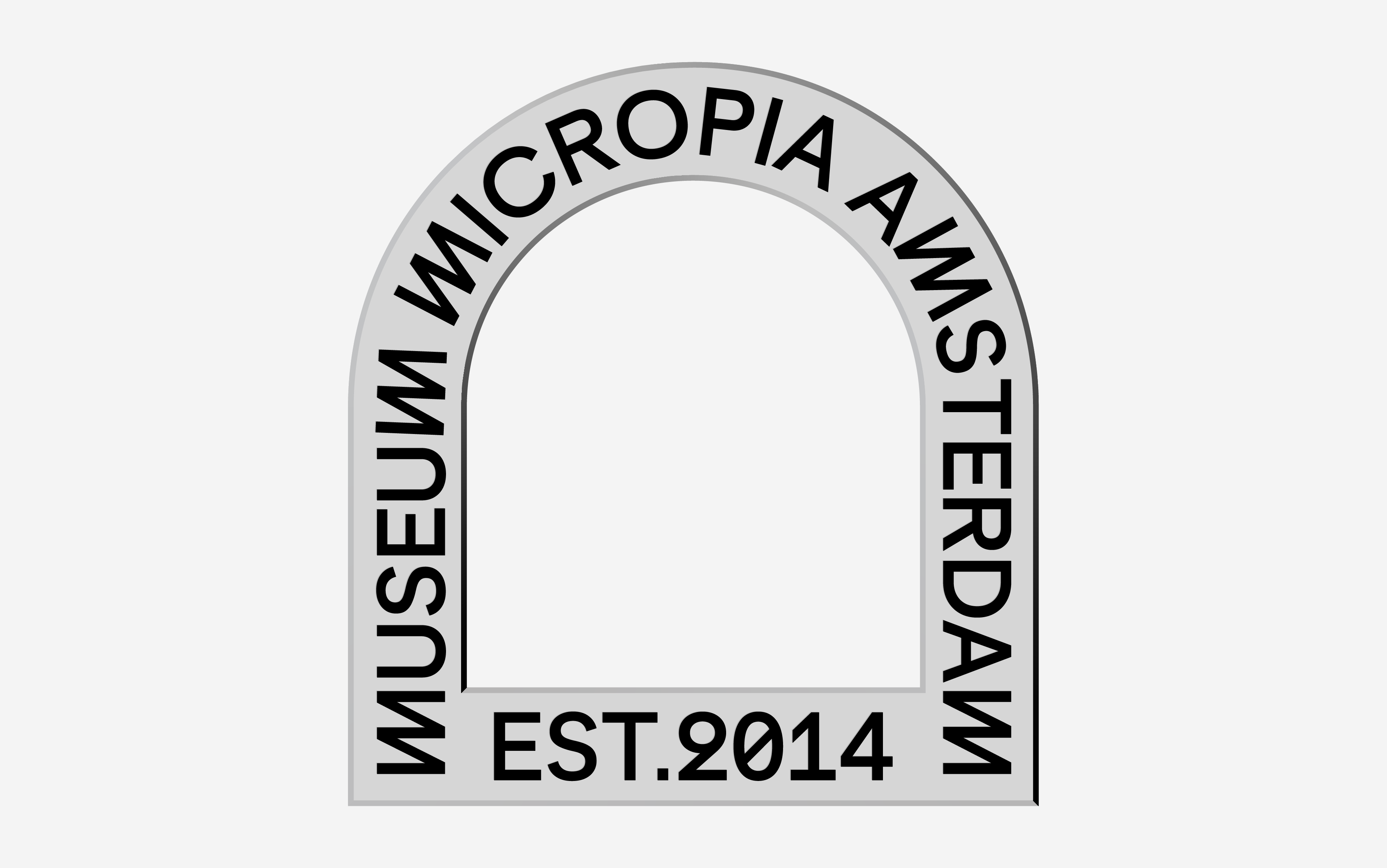
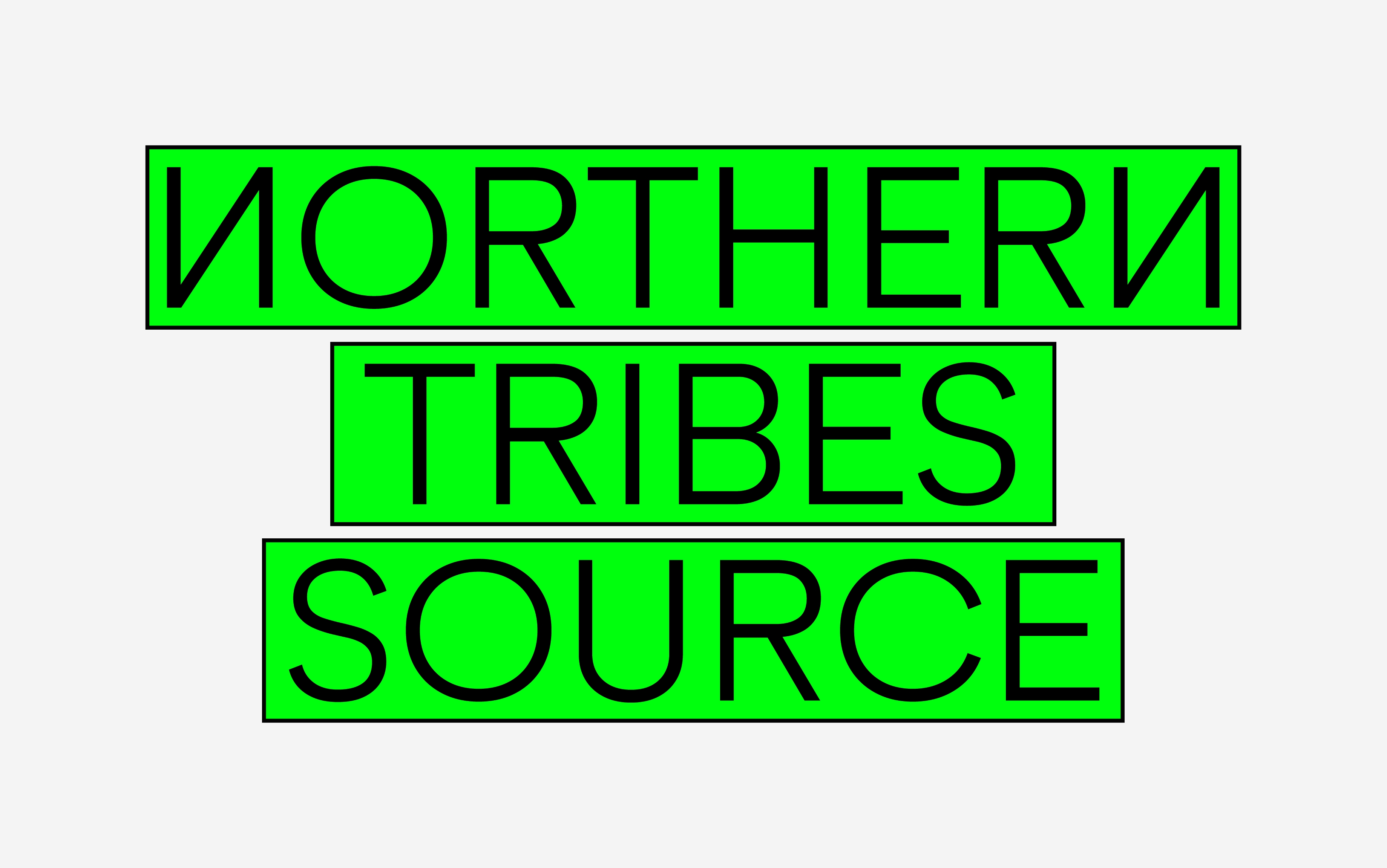
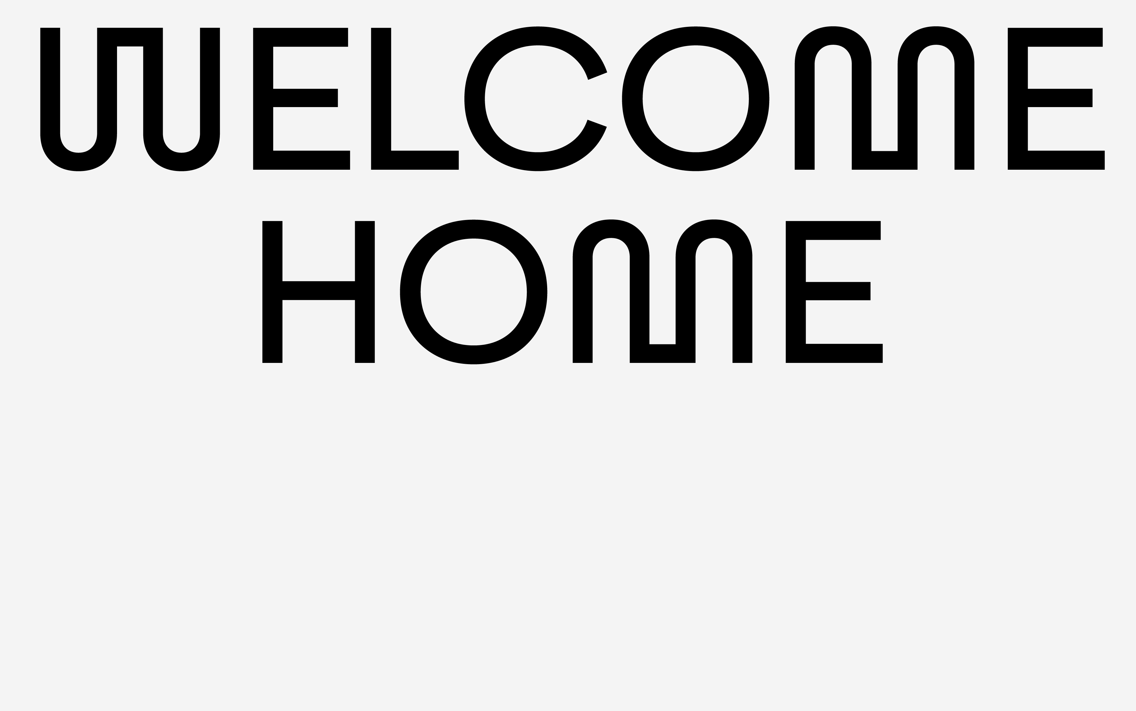
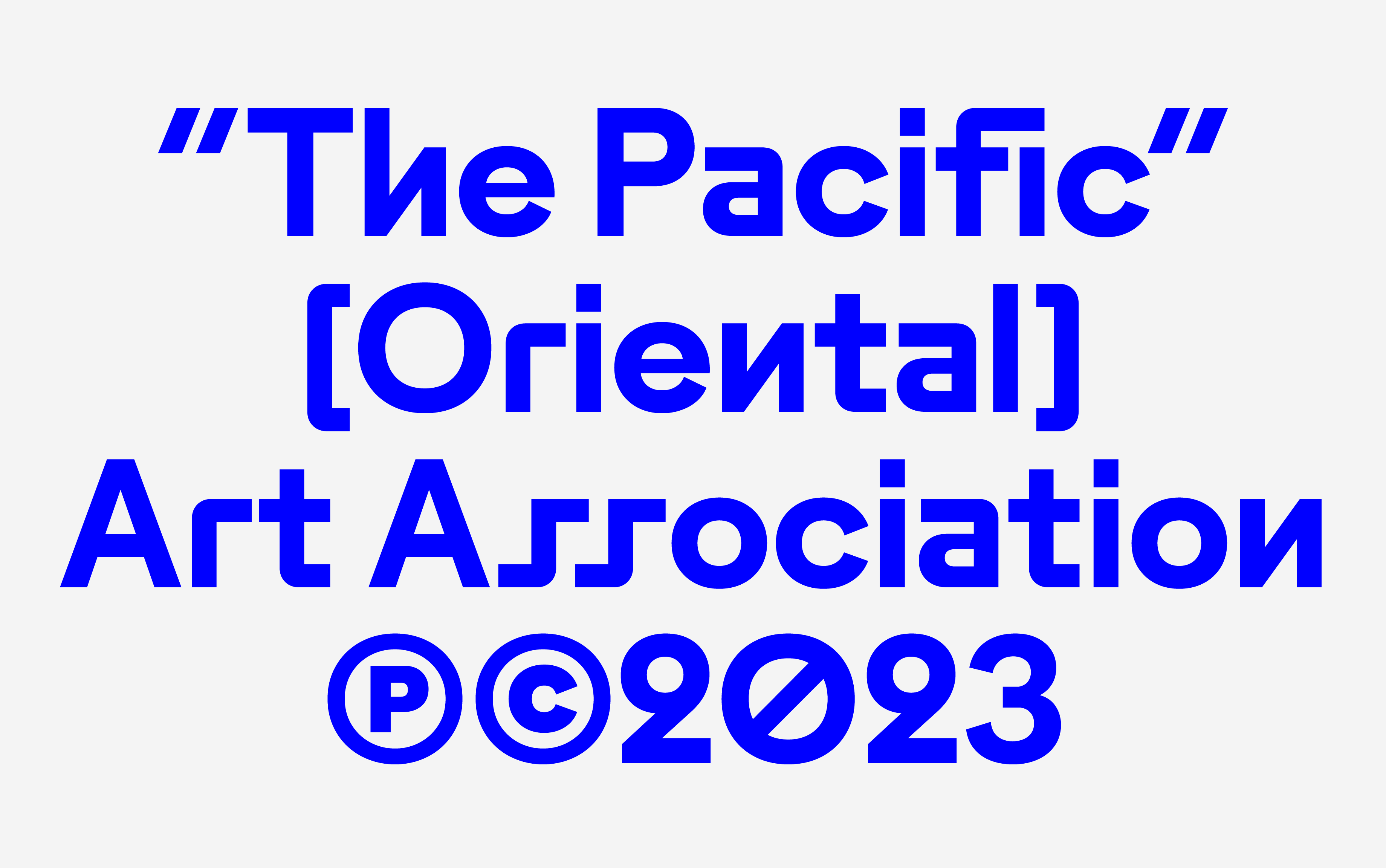
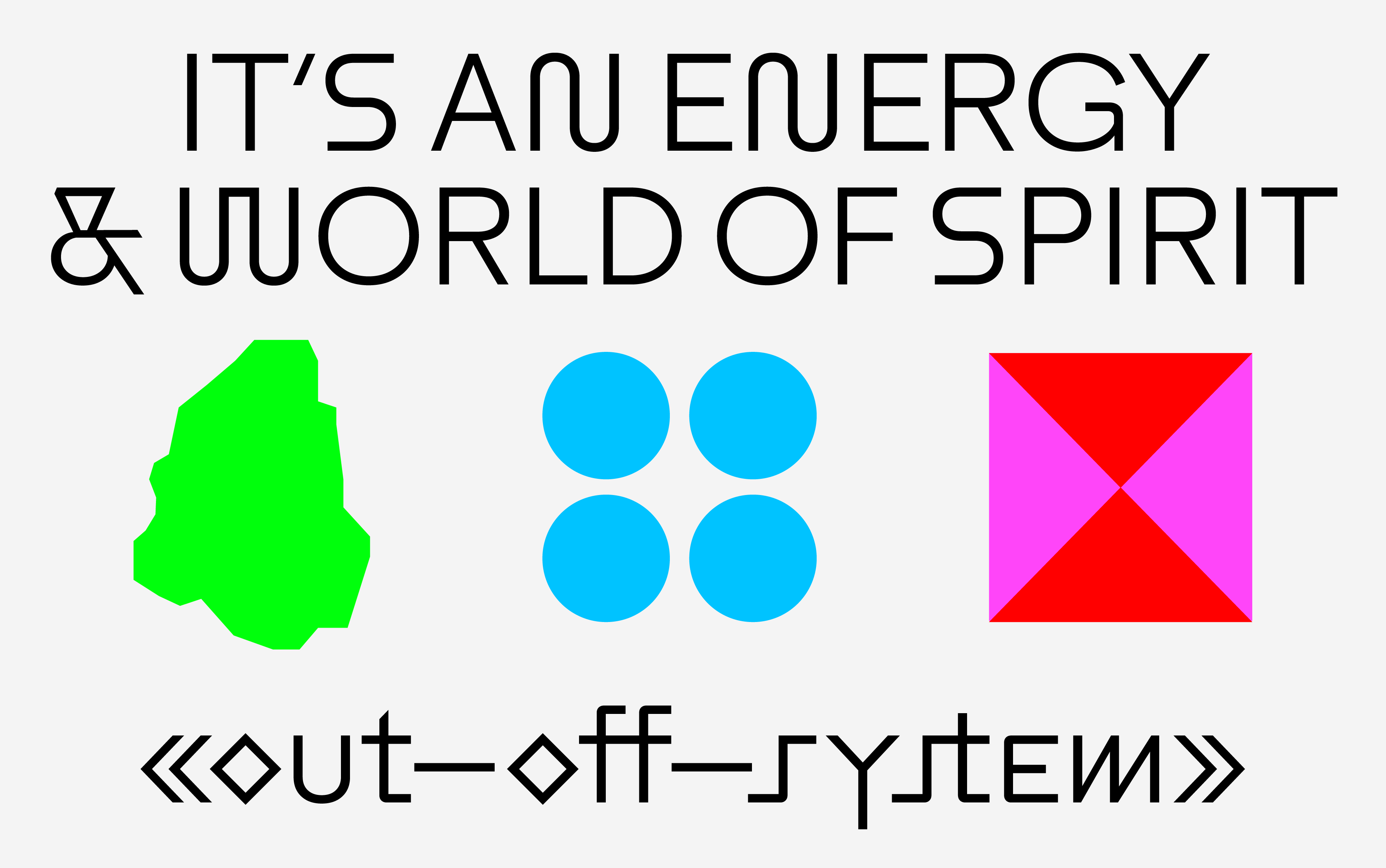
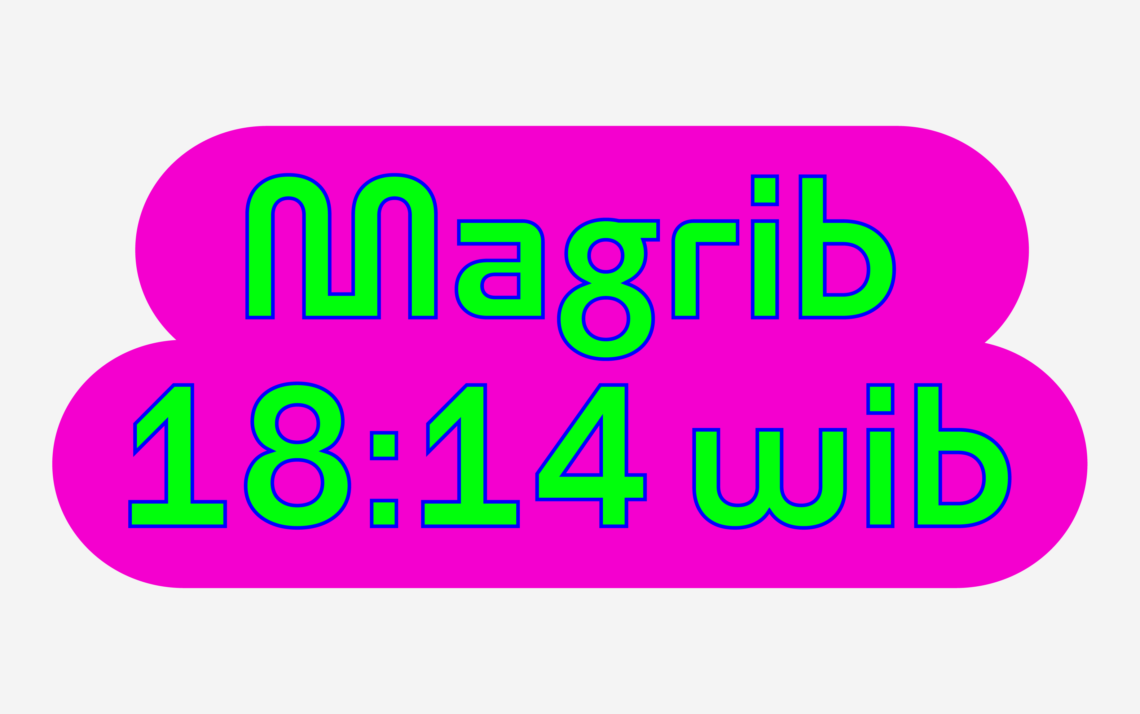
LCT Utara is a modern contemporary sans serif typeface designed with a refined monolinear thickness, meticulously adjusted for optimal optical balance. Its clean lines and versatile structure make it suitable for a wide range of design applications, from editorial layouts to branding and digital interfaces.
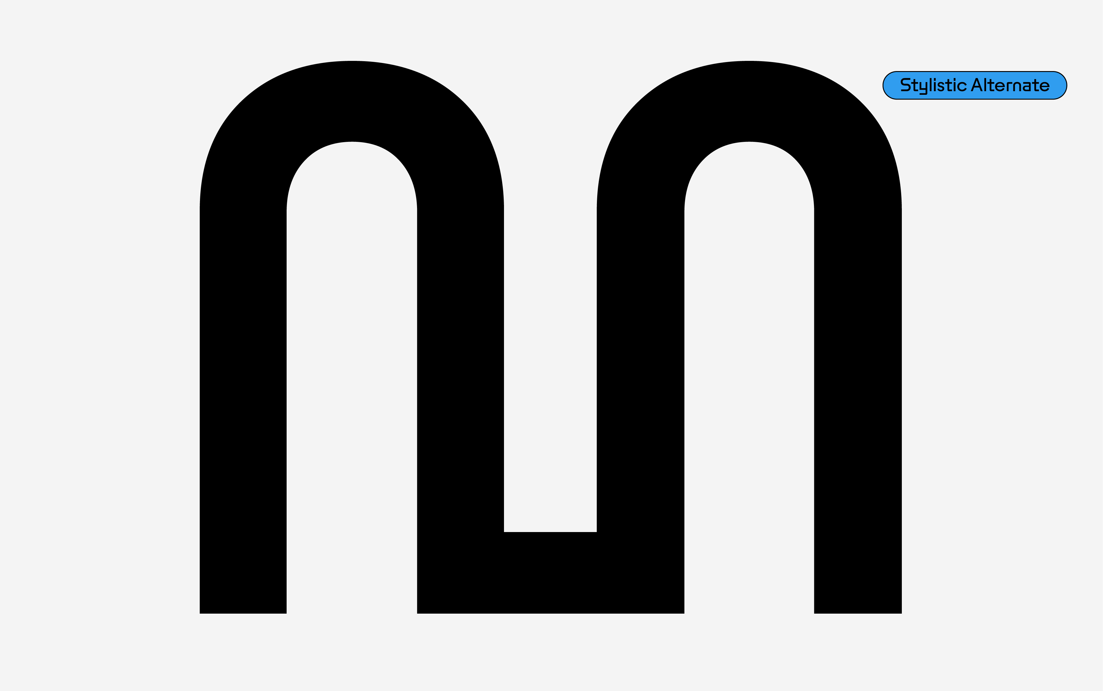
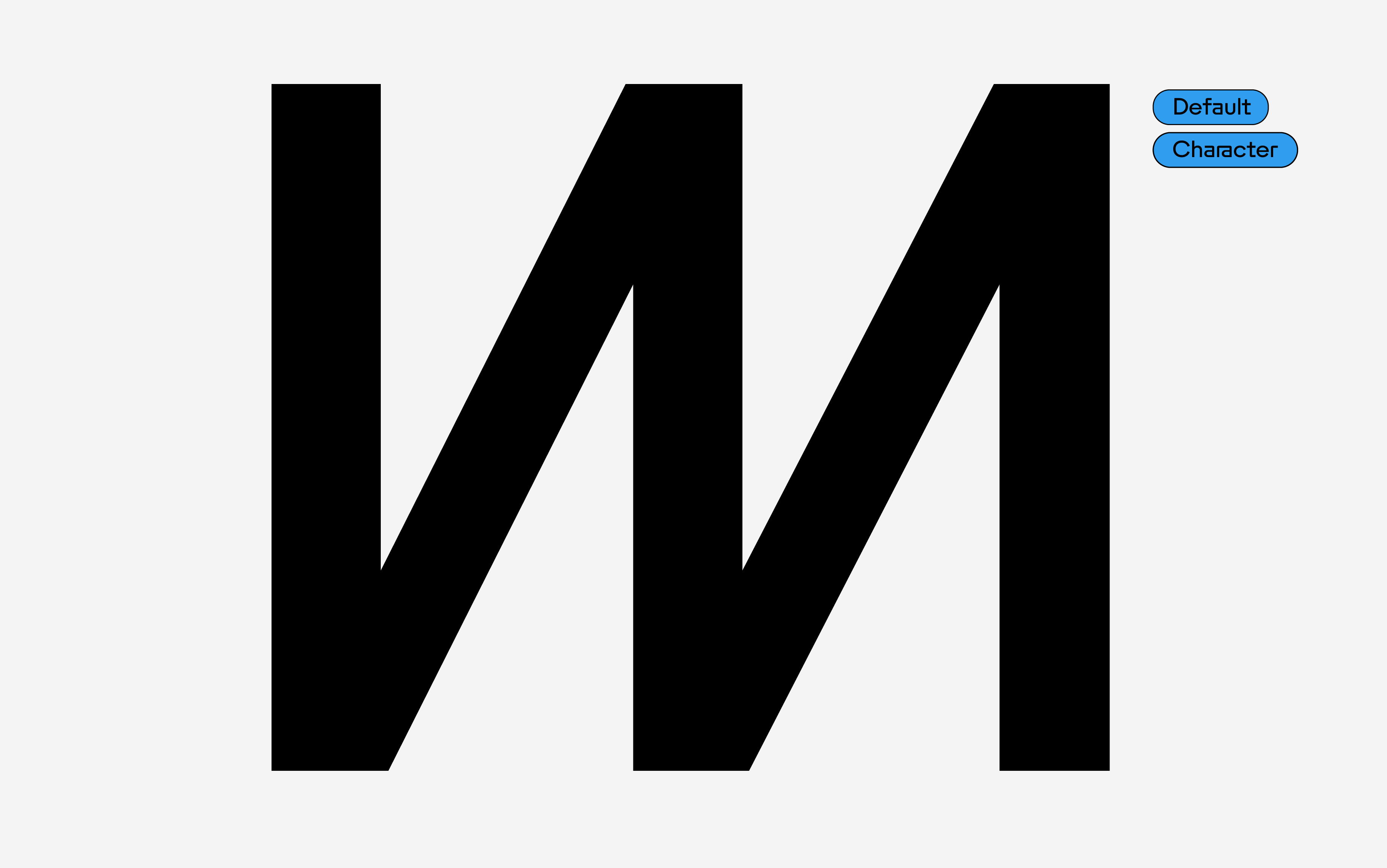
Rich in typographic features and unexpected character alternatives, LCT Utara offers designers creative flexibility to adapt its personality to various contexts. Its extensive character set and OpenType features allow for unique stylistic variations, adding character and nuance to both text and display use.
With five carefully crafted weights—ranging from Light to Bold—LCT Utara ensures readability and visual impact across different sizes and media. Additionally, its variable font support provides seamless control over weight adjustments, empowering designers to fine-tune the typeface for both print and digital environments. Combining modern aesthetics with practical versatility, LCT Utara is the perfect choice for projects that demand clarity, sophistication, and a touch of typographic individuality.
Designed By: Deni Anggara
Available Format: TTF | OTF | WOFF2 | VAR
Version: 1.0.0
Last Update: 09-01-2023
Language Support: Extended Latin / Adobe Latin-1 / ISO 8859
LCT Mogi
Publish Date: 01–05–2023




NEW RELEASE
LCT. Mogi
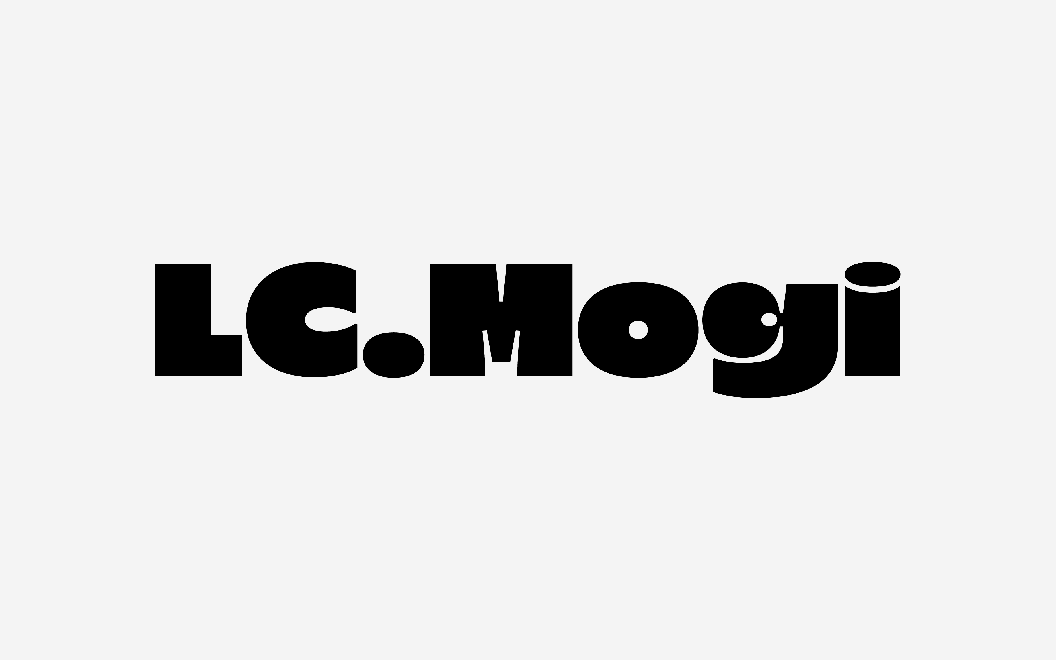
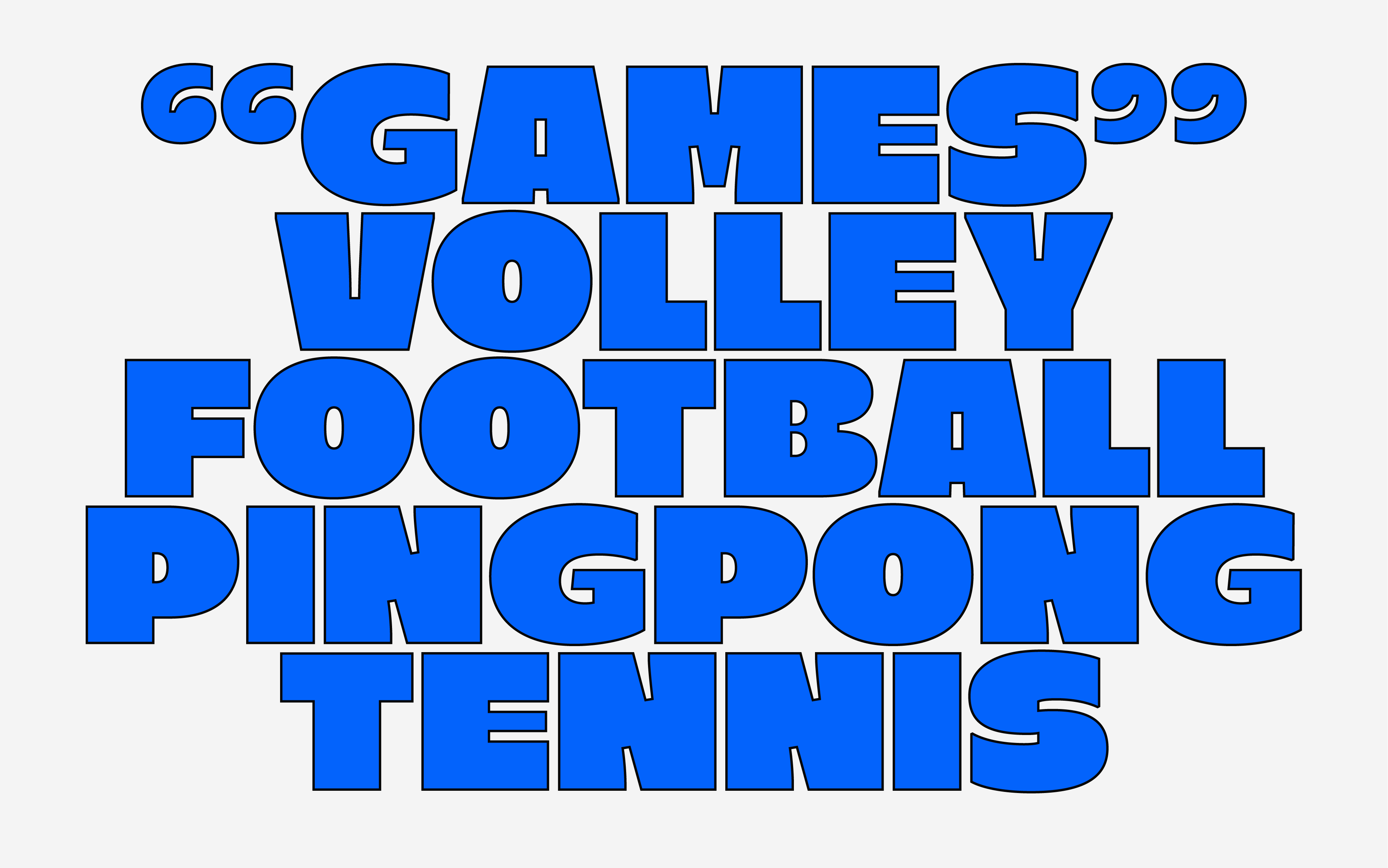
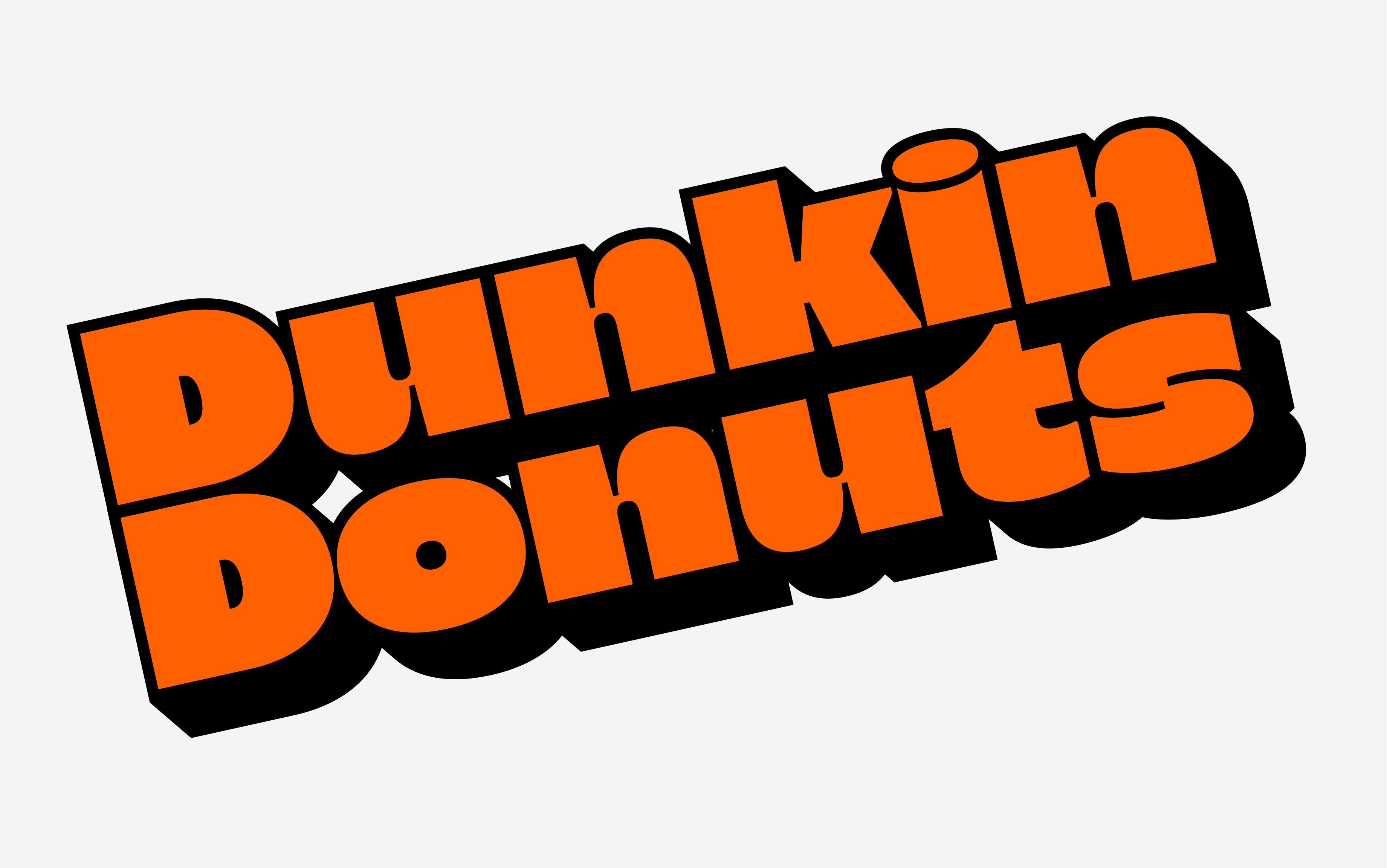
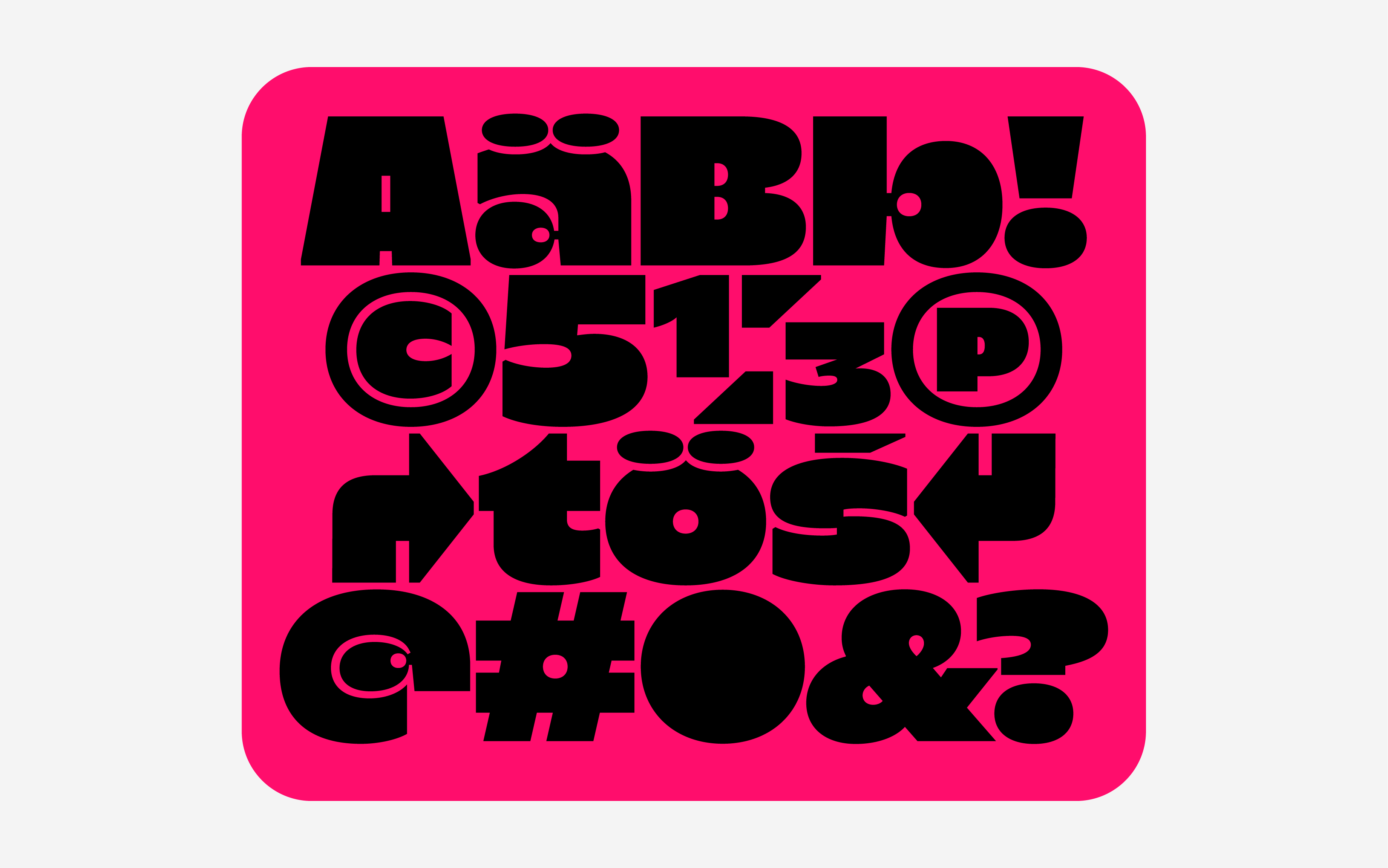
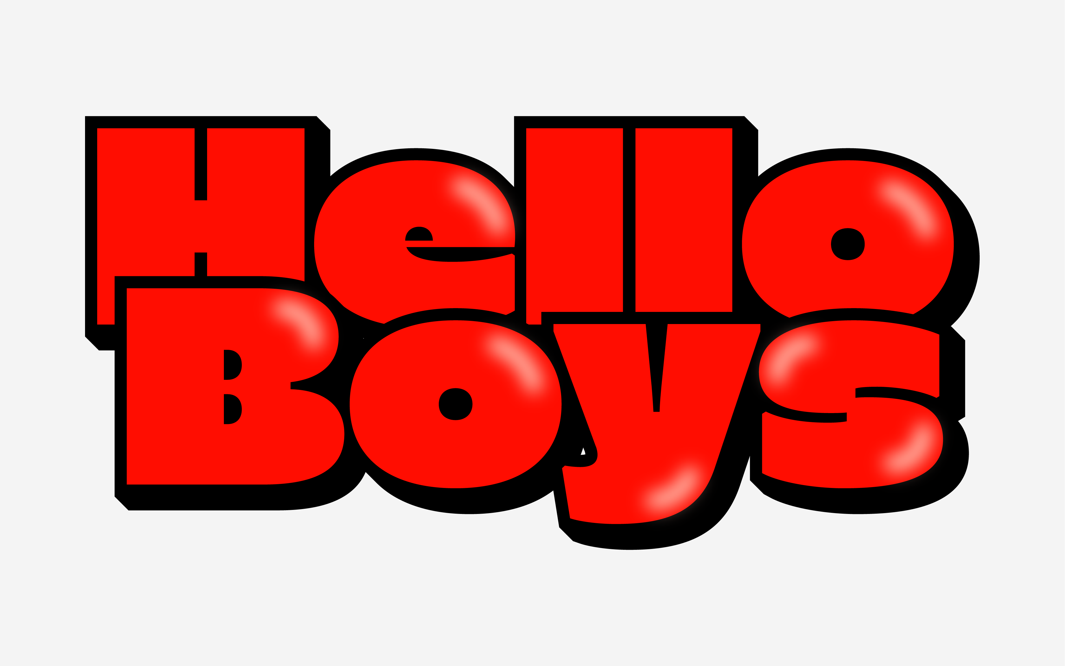
LCT Mogi is a bold and expressive display typeface designed to capture attention with its striking presence. Characterized by its large size and variable width, LCT Mogi offers versatility and adaptability, making it suitable for headlines, posters, branding, and digital interfaces. Its wide axis allows designers to adjust the character width, from condensed forms for compact layouts to expanded shapes that maximize visual impact.
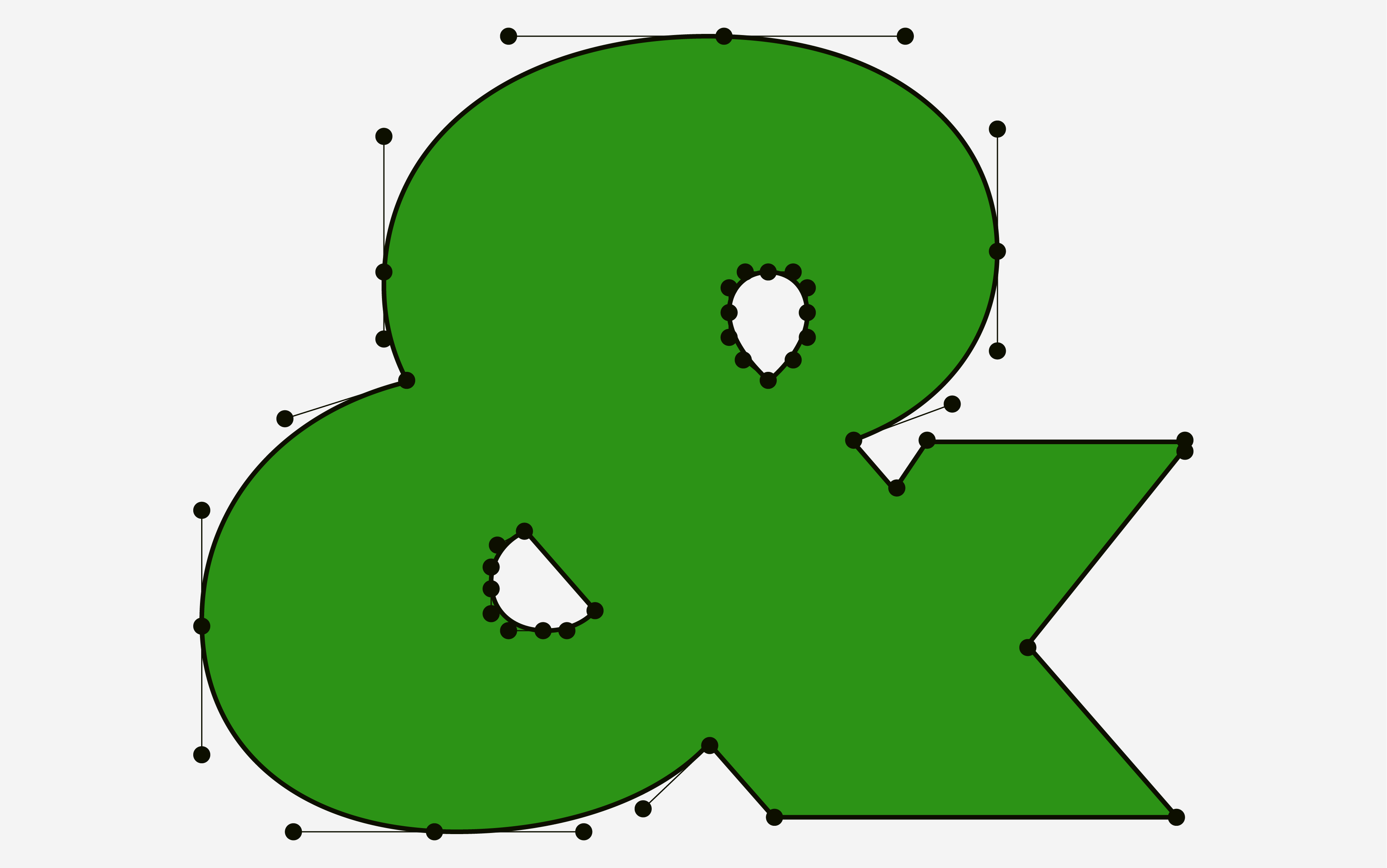
With strong geometric foundations and clean lines, LCT Mogi maintains readability while delivering a modern, dynamic aesthetic. The typeface balances boldness with refined proportions, making it ideal for both contemporary editorial design and eye-catching advertising. Its variable width feature adds creative flexibility, empowering designers to create unique compositions and visual hierarchies.
LCT Mogi’s fat, rounded letterforms and playful bounce-like shapes give it a friendly yet impactful personality. The combination of thick strokes and subtle curves adds warmth and character, making the typeface stand out in both digital and print environments. This balance of heft and rhythm creates a sense of movement and energy, perfect for designs that need to be both visually striking and approachable.
Available Format: TTF | OTF | WOFF2 | VAR
Version: 1.0.0
Last Update: 09-01-2023
Language Support: Extended Latin / Adobe Latin-1 / ISO 8859
LCT Iptex
Publish Date: 01–05–2023


NEW RELEASE
LCT. Iptex
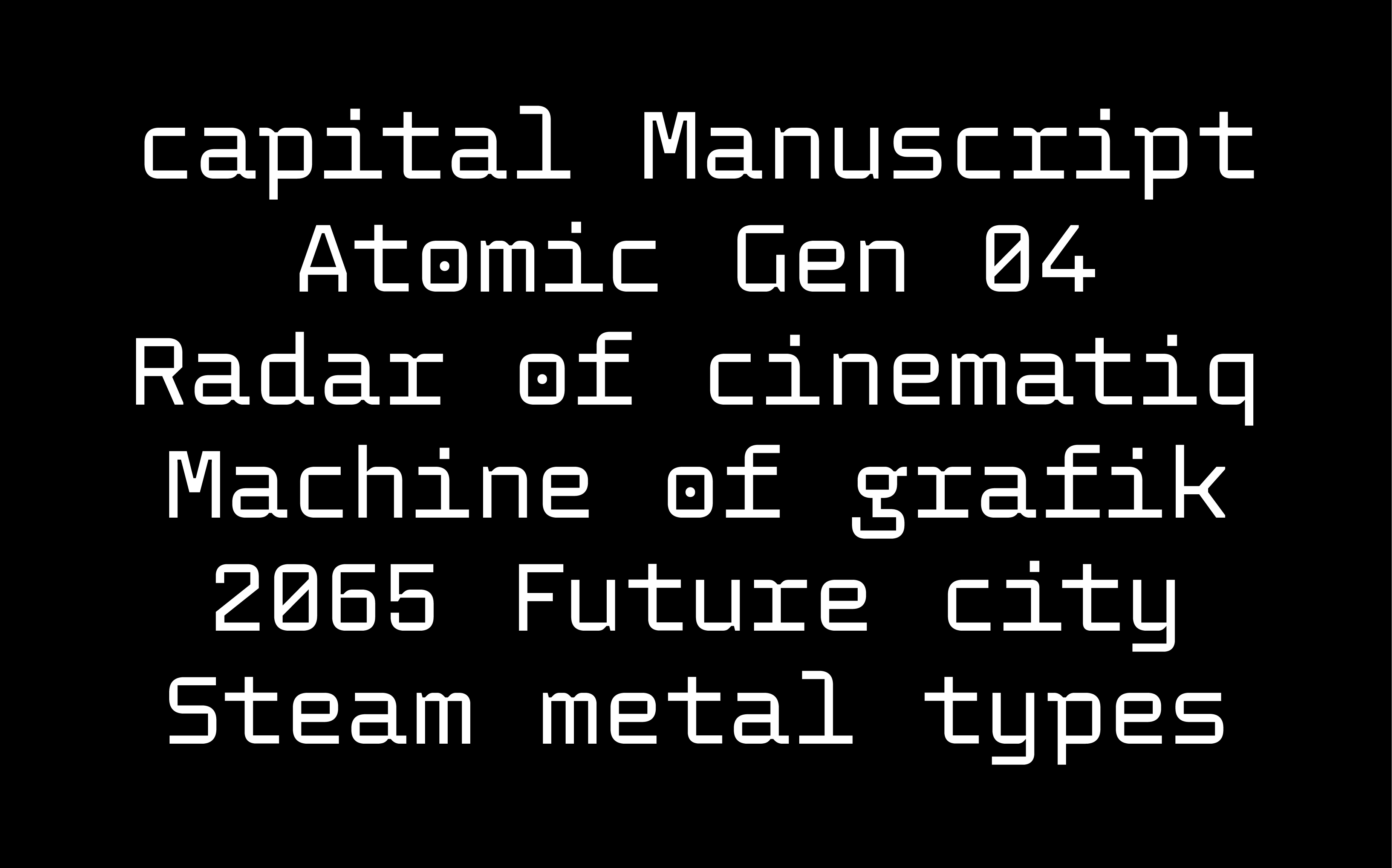
LCT Iptex is a futuristic monospace typeface inspired by the modular design principles of Wim Corwel. With its geometric precision and modern aesthetic, LCT Iptex embodies the essence of contemporary modular forms. Each character is crafted with clean lines, balanced proportions, and a consistent rhythm, reflecting both functionality and visual harmony.
Designed for both digital and print applications, LCT Iptex offers a sleek, high-tech appearance suitable for coding environments, UI design, and branding that seeks a forward-thinking look. Its monospace structure ensures alignment and clarity, while subtle design details add character and personality. LCT Iptex stands as a testament to the fusion of modern minimalism and futuristic innovation, making it an ideal choice for projects that demand a bold, cutting-edge typographic voice.
Available Format: TTF | OTF | WOFF2 | VAR |
Version: 1.0.0
Last Update: 09-01-2023
Language Support: Extended Latin / Adobe Latin-1 / ISO 8859
LCT Ciburial
Publish Date: 01–05–2023



NEW RELEASE
LCT. Ciburial
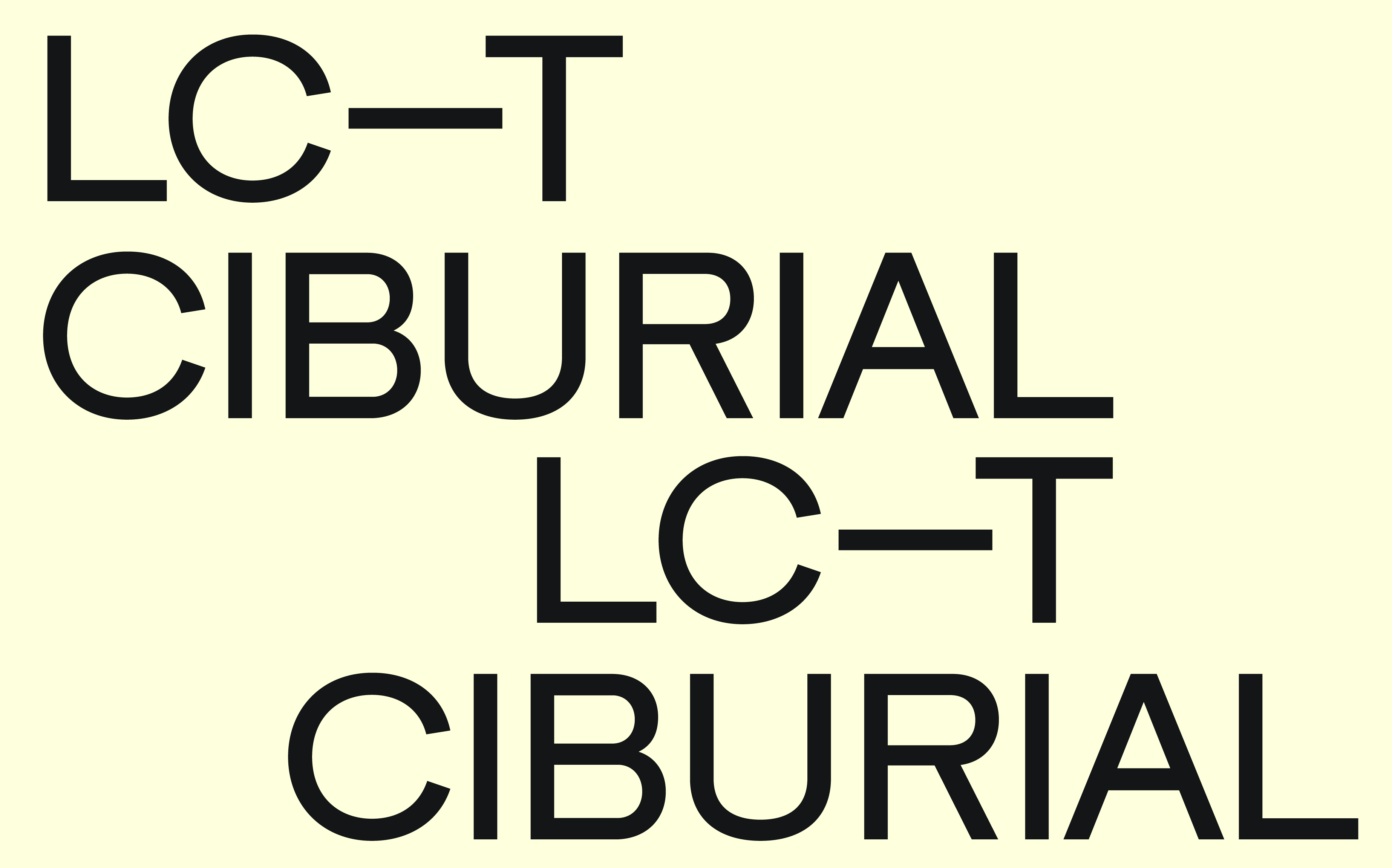
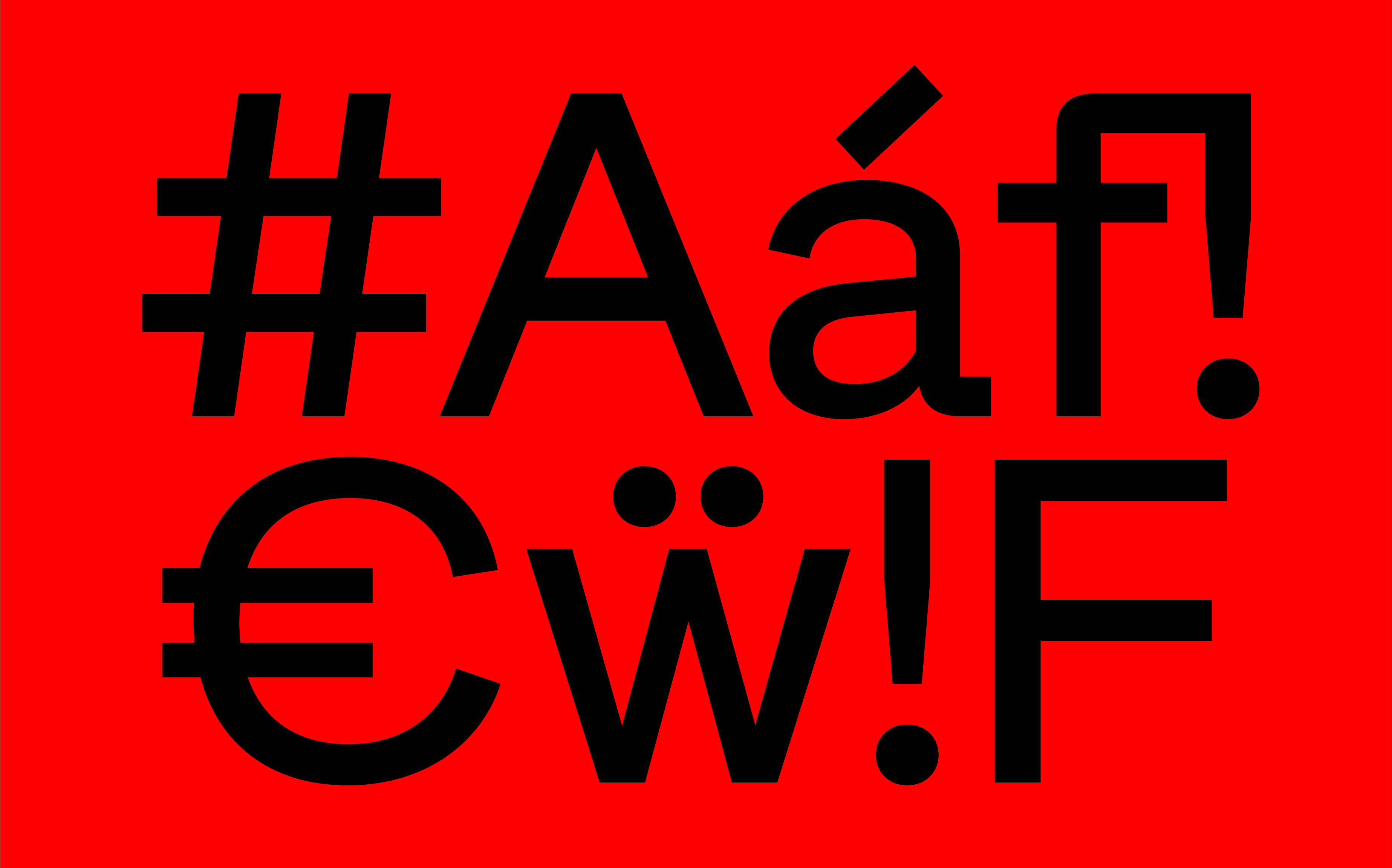
LCT Ciburial steps onto the design stage with a modern, technical edge that instantly grabs attention. This sans serif isn’t just about clean lines—it’s a strong statement of character, confidence, and craftsmanship. Each letter carries a strong, distinct personality, shaped by a contemporary spirit and infused with raw industrial aesthetics.
Though LCT Ciburial comes in a single weight, it delivers surprising versatility. Its well-balanced letterforms strike the perfect harmony between strength and elegance, making it adaptable across a wide range of design needs. With near-monolinear strokes and subtle optical adjustments, it holds its ground at both large and small sizes with exceptional clarity.
But LCT Ciburial isn’t just about functionality—it’s about attitude. Its industrial undertones bring a raw, urban energy that resonates with contemporary design trends. Whether it’s headlining a music magazine, powering up a brand identity, or adding a sleek edge to digital interfaces, LCT Ciburial stands out with clarity, confidence, and unmistakable style.
Designed By: Deni Anggara
Available Format: TTF | OTF | WOFF2 | VAR
Version: 1.0.0
Last Update: 09-01-2023
Language Support: Extended Latin / Adobe Latin-1 / ISO 8859